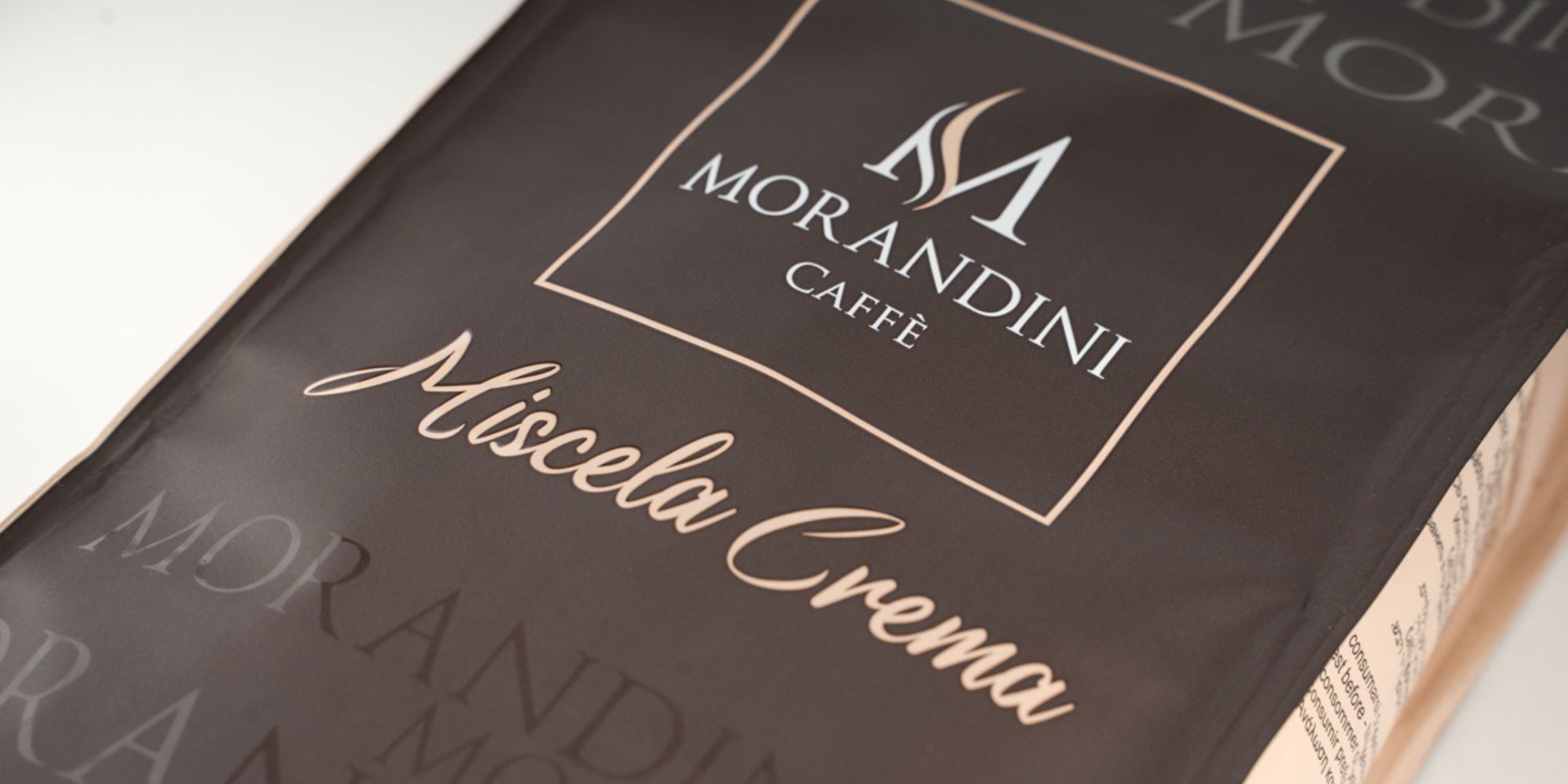
The packaging of the products belonging to the traditional Morandini-branded lines was the first to be affected by the company’s image renewal. The leitmotif of the process has not changed: cleaner lines, sobriety and recognizability.
The new packaging of the company’s traditional products in beans, i.e. Miscela Oro, Miscela Crema, and Miscela Supercrema, has undergone a significant change. Now a sober colour, brown, is used on both the front and the back of the package; the sides and details have deliberately been allotted distinctive colours, specific to each individual product: for Miscela Crema, a delicate beige with pale pink nuances has replaced the traditional blue; for Miscela Supercrema, the green has given way to a sparkling ‘goose beak’ orange; Miscela Oro has abandoned its classical bright red and has now been revamped with a shining gold.
The brown printing that covers the majority of the package's surface is mainly matte, on which, however, the word “MORANDINI” has been repeatedly impressed, tone on tone, thus playing with size and finishing. These words in fact have different sizes and a polished finish that, in contrast with the matte base, generates both an impressive visual effect, which varies according to the light, and a pleasant sense of touch.
A glossy varnishing has been applied on the coloured sides and the details, so that the distinctive features of each product’s package are immediately identifiable.
This aesthetic choice has been applied not only to the Morandini-branded products in beans, but also to the historical Miscela Crema in ESE pods and the brand-new 100% compostable Nespresso compatible capsules' line.
A NEW LOOK, THE SAME (GREAT) QUALITY AS EVER
06 June 2023
THE NEW caffemorandini.it
22 May 2023
CAFFÈ MORANDINI GETS A NEW LOOK
04 May 2023
Coffee and its territory
02 March 2023
Dubai’s “Speciality Food Festival 2022”
27 September 2022